2D flat illustrations – runs the world (of illustration)?
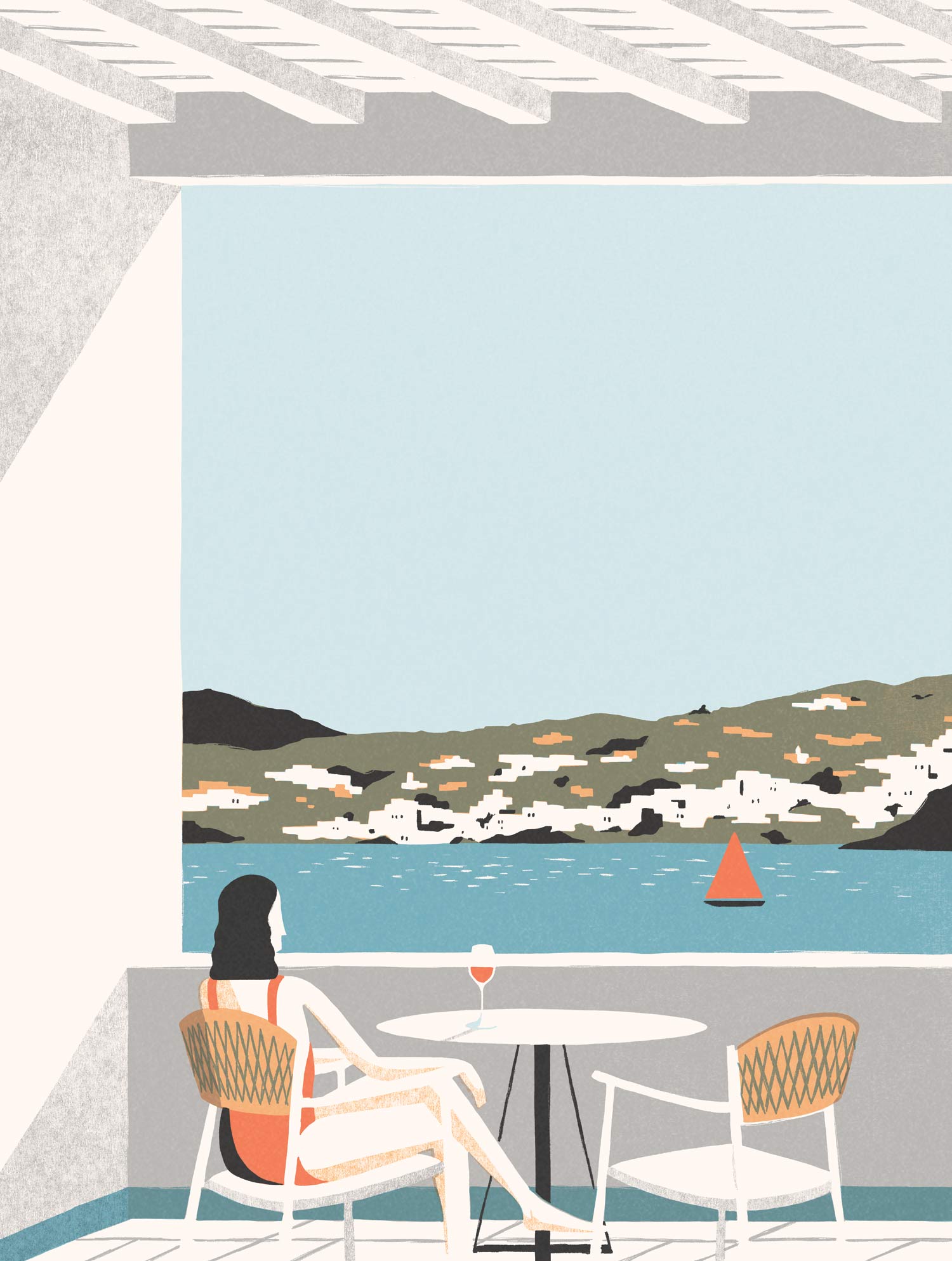
It is kind of paradox, when the whole world is now obsessed with 3D world or even more D. But world of illustration is demonstrating, that it doesn’t matter how many dimensions you have ;-). Publishers, art directors, ad companies – they just love 2d flat illustrations. Flat design offers purity, elegance and sophisticated way how present reality. We love David Doran‘s ability to capture atmosphere with only few elements:
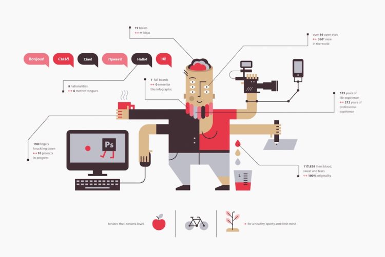
2D flat illustrations are also popular for educational purposes. It doesn’t have any “noise” so could be used for explaining and presenting more complex ideas. Artist Alexandra Turban created agency monster, which has all digital agency skills.
What else to add? We love flat design and we enjoy this fashion wave. It begun in 80s, but first trendsetter was surprisingly Microsoft, when they released Windows Phone 7 in 2010, which used a flat-design. However, Egyptians started it way earlier. Since then, you can see it everywhere. But be careful, it might be easy to drop into cliché. What do we suggest to avoid “I-saw-it-before”? Be open for experiments with textures, sizes, colors and imaginary worlds.
