Preparing visuals for spring and summer is always a challenge, particularly because it is often designed in advance. This means during the winter. Switching to refreshing, shiny visuals when there is snow outside is hard. Delivering visuals that will keep up with summer trends of next year is even harder.
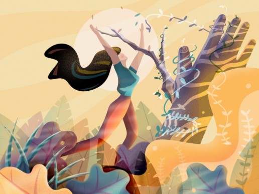
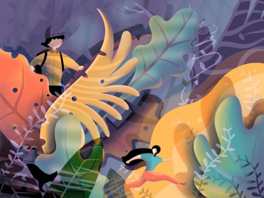
One of the interesting techniques is creative multiplication. In fact, it is a safe bet on the most popular trends, but with qualitative change that expands the popular visual style by multiplication of elements, textures and colours in the visual.
In essence, quality multiplication just means utilising the one resource you have, when preparing work in advance: time. It is fascinating, how this process can change styles in almost complete way.
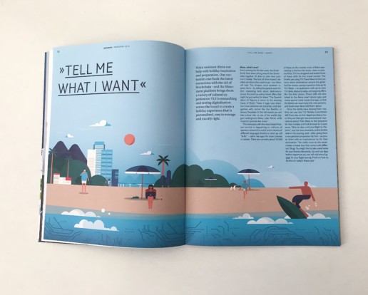
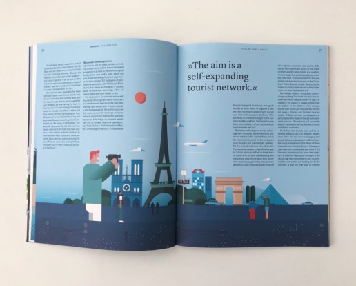
It does not matter how do you approach it. For instance style of Fernando Volken Togni is an excellent example of flat illustration style with excessive richness of elements. See illustrations for TUI Moments magazine below.
The flat illustration style is characteristically minimalistic. However, if you just add more time, more textures and more ideas and you end with astonishingly beautiful artworks, grabbing the reader by hand and leading him into deep and rich painted canvas.
There is more than 100 precisely curated illustrators on Minty and Owl Agency sites. Also, if you are looking for ready made illustrations, they can be found curated by Minty curators exclusive for Adobe Stock.


